Recently Dan Kaminsky announced a new DNS vulnerability. This isn’t a vulnerability in a particular DNS implementation but a problem with the DNS protocol itself. You can find information from CERT here. The exact details of the vulnerability were kept quiet even after DNS software vendors simultaneouslly released patches to mitigate the problem. One of the main changes made by these patches was to increase the number of source ports used for outgoing queries to other DNS servers. From this information it was wildly speculated that the vulnerability is related to cache poisoning.
Perhaps partly due to an accidental, early release of information the full vulnerability details are now available.
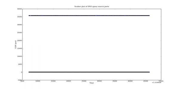
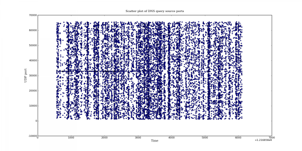
I happened to have some DNS captures available from before and after the patch was applied so I thought it might be interesting to graph the UDP query port usage behaviour for before and after the patch. The graphs presented below come from a RHEL 5.2 based DNS server. The post-patch DNS server version is bind-9.3.4-6.0.2.P1.el5_2. I don’t have the pre-patch version number handy but presumably it is the previous Bind package released by RedHat. Both of the captures came from the same DNS server but note that the capture length is different.
The difference is quite dramatic. Bind appears to be making good use of almost the entire port space.
Also note the interesting banding in the second graph. This behavior is not limited to the new patch. I have noticed this in other pre-patch captures as well. More on that later.


One extra note: when talking about the banding I was referring to the vertical banding. The horizontal band is also interesting. Does it indicate a slight preference for that port? I am grabbing another capture now to see if this behaviour still exists.
Pingback: Dan Siemon » More fun with DNS packet captures
Hey…just interested in how you generated these graphs…i’ve got some PCAP files and i want to generate good looking graphs on the bandwidth utilisation of link.
Any hints pls?
Cheers
The graphs were created with Python and the following libraries:
matplotlib – http://matplotlib.sourceforge.net/
dpkt – http://code.google.com/p/dpkt/
pypcap – http://code.google.com/p/pypcap/